Oh man, this is looooooong. Sorry! Feel free to skip all that tedious text and just look at the picture—if you like, you can scroll down to see the 3 or 4 versions showing minor variations, plus some sketches I used while working out the idea.
Back in January, I recommended this fanfic of Pern; one of the things the author mentioned was wanting art, especially portraits. Well, um, my original training was life drawing, to the point where I ran out the course numbers. I figured I could:
- practise some of the media I've had lying around for, um, 4 decades or so;
- practise portraiture (I'm pretty rusty:)
- play with illustration—I originally wanted to be a sf&f cover artist! —I gave that up shortly after graduating college, but I've long admired the greats, from the 50s–80s especially; naming them all would probably delay this page another week, as I continued down memory lane though this listicle mentions many of my faves.[1]
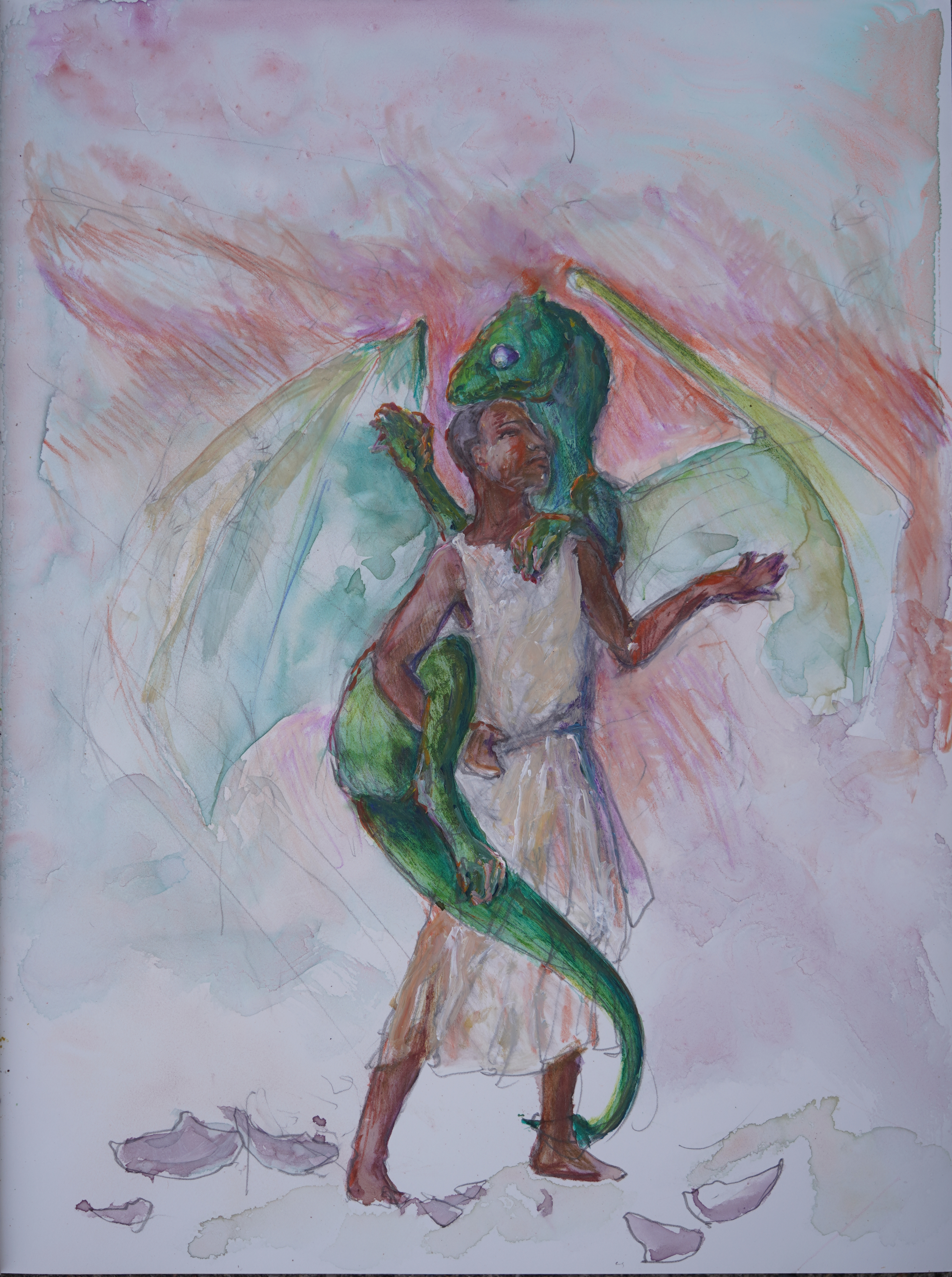
Impression (final); graphite, granulated and standard watercolours, coloured pencils, pastel pencils, acrylics on Karst brand stone paper; about 24x18cm; photographed 25mar26 with a sony A7c, sony 90mm macro, f/2.8, ev +0.7, 1/800s, ISO 100, WB: auto; cropped and darkest regions slightly lightened in gimp. NOTE BENE: all images on this page are CC0 licensed, that is, explicitly placed in Public Domain.
Spoilers for Dragonchoice V follow.
I knew[2] that the author of the original series, Anne McCaffrey, was especially fond of Michael Whelan's art for The White Dragon, so his depictions of Pernese dragons in general and that one in particular is the basis for my depictions of dragons.
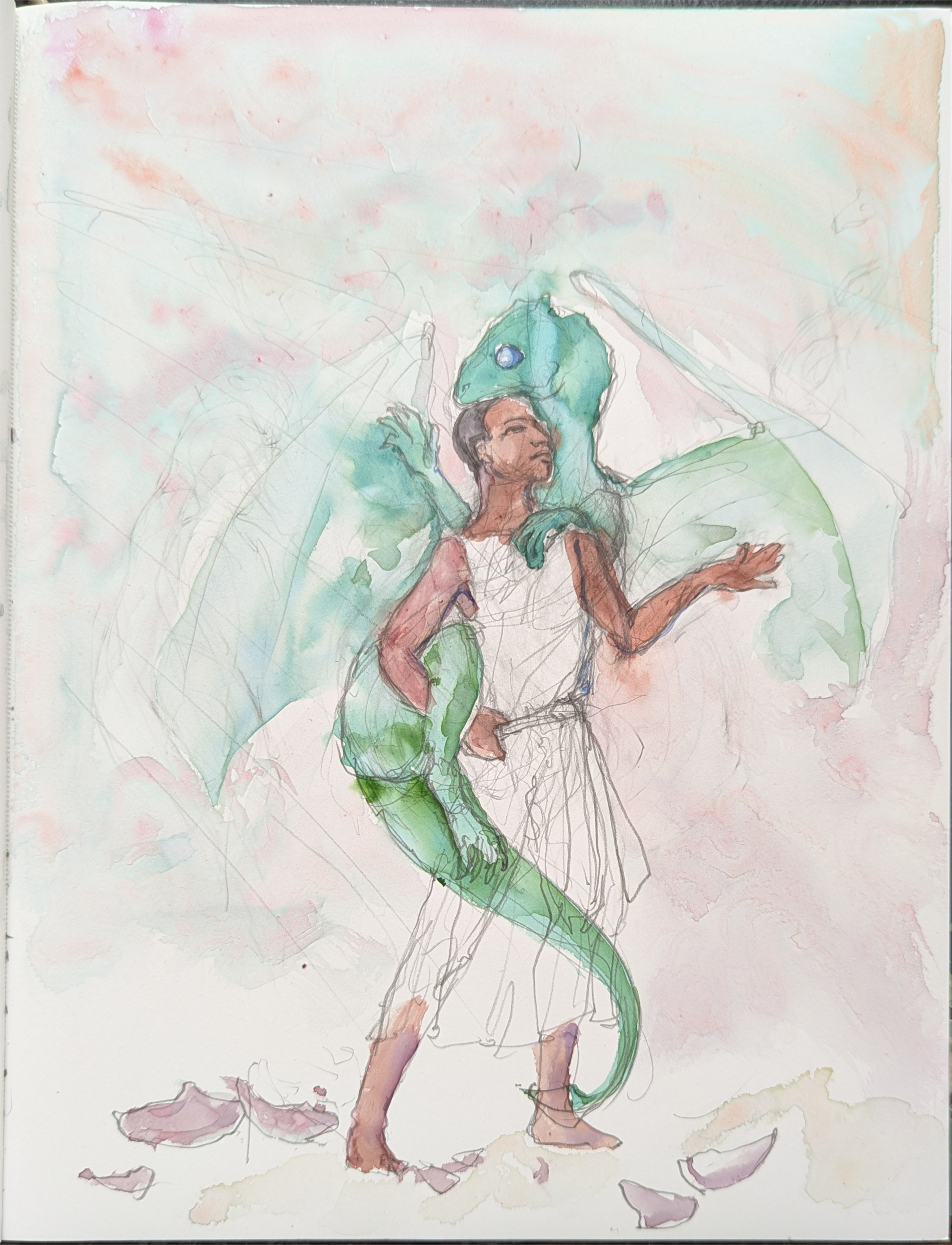
first Instance: graphite and watercolour only. It's always very tempting to leave work at this pretty, unfinished stage (which tends to be my favourite even with the greats—there's a reason that Michaelangelo's Study for the Libyan Sibyl is my favourite drawing of all time) but the fastest way to get good is to push. To failure. Onward!
Nevertheless, especially as depicted in Dragonflight, Ramoth has a very broad, ventrally flat chest, and human-like pectorals. This is more bat-like, upon which Whelan obviously & sensibly based Pernese dragons’ wings. But, bats recruit their clavicles and scapulae for flight, which makes adding in convincing forelegs really difficult; birds, on the other hand, sport a large, heavy keel bone, and their flight muscles primarily attach to this sternum—leaving the clavicles and scapulae (sort of) available for the forelegs. In many animals (humans included) the clavicles attach to the sternum, but in cats, for example, they float, so I sort of envisioned the shoulder muscles wrapping around the wing muscles.[3]
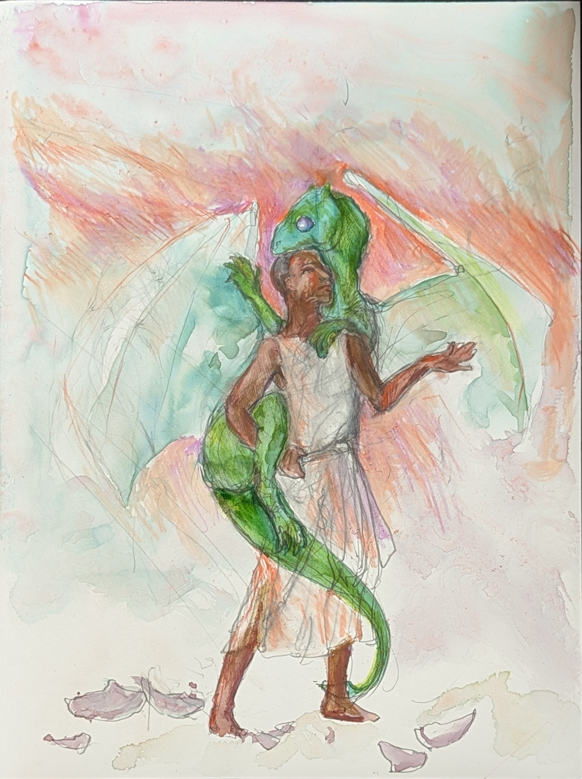
2nd instance: adding pastel pencil layering on the watercolour. Honestly, at least using the photographs to judge (not the same as the actual, physical art!) this version is probably my fave, despite that dreadful right foot of Kistrith's!
It's likely no better a solution than Whelan's but for the moment, it's my preference, not least because dragons look more like dinosaurs (of which birds are the modern example) more than anything else, so even though bat wings make a lot of sense for a featherless animal, I relied more on bird anatomy for underlying wing structure; after working that out, then I had to figure out what the human character looked like, since all the text says about him is that he's the biggest in his class and he's dark skinned. Oh, and that he has nicely muscled arms. So, slender or stocky? Handsome or plain or somewhere in between? The admiration for his arms comes up in the context of a girl his own age admiring them, so his facial features are probably fairly typical; but is his head round or long or heart-shaped, are his lips thin or full, his nose and mouth wide or narrow, his hair straight, curly or wooly?
None of those details matter to the story, and particularly as fan-fic has this reputation of over-describing characters (with violet eyes and shining gold hair, no less...) you can hardly blame the writer for following my very favourite author's lead[4] but then that means I have to make these arbitrary choices that may subvert the text. I mean, how his head is shaped probably doesn't matter (excepting the need to differentiate him from everyone else,[5] but hair texture is a bit trickier, because—in the US at least, but I think also in a lot of other places, thank you colonialism—it is a racial signifier.
So how do I pick? Well, in the end, since I grew up in Detroit, which is majority-Black, I went with that.
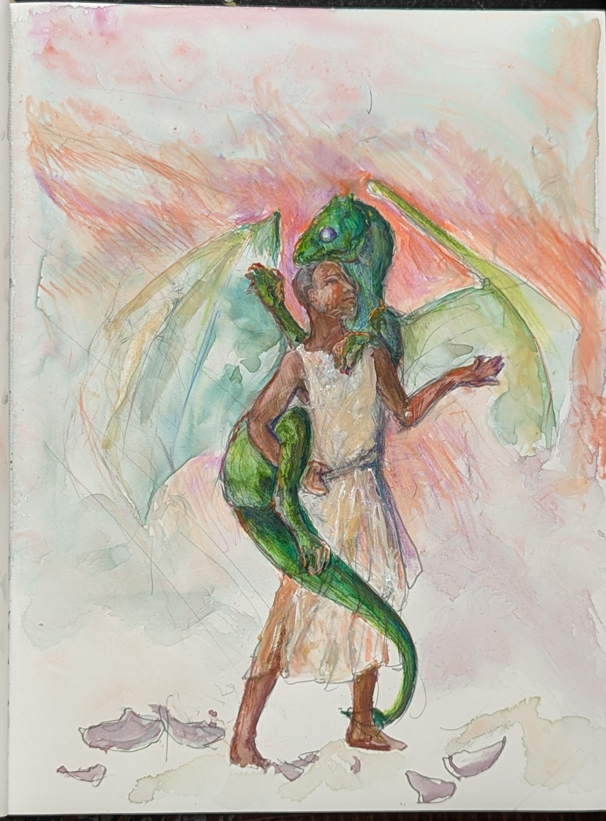
are you sick of this image yet? This is the cell phone version, which at full resolution has some interesting artifacts that I kinda like. If I wanted to digitally edit this image, I'd start with this one. (Well, let's be honest, I'd probably put all of them in layers, & then start playing;)
But as it happens, upon re-reading, the character keeps his hair ‘shaven-short’, meaning I had the freedom to draw him however I liked:) (Also true for readers, and a nice way to acknowledge the importance of this in the real world, while downplaying it in Pern, where it's not an issue. Yay. Kudos.) Similarly, since he's just wearing a shift, I didn't have to figure out clothes, which tend to be described in terms of richness, not construction details:)
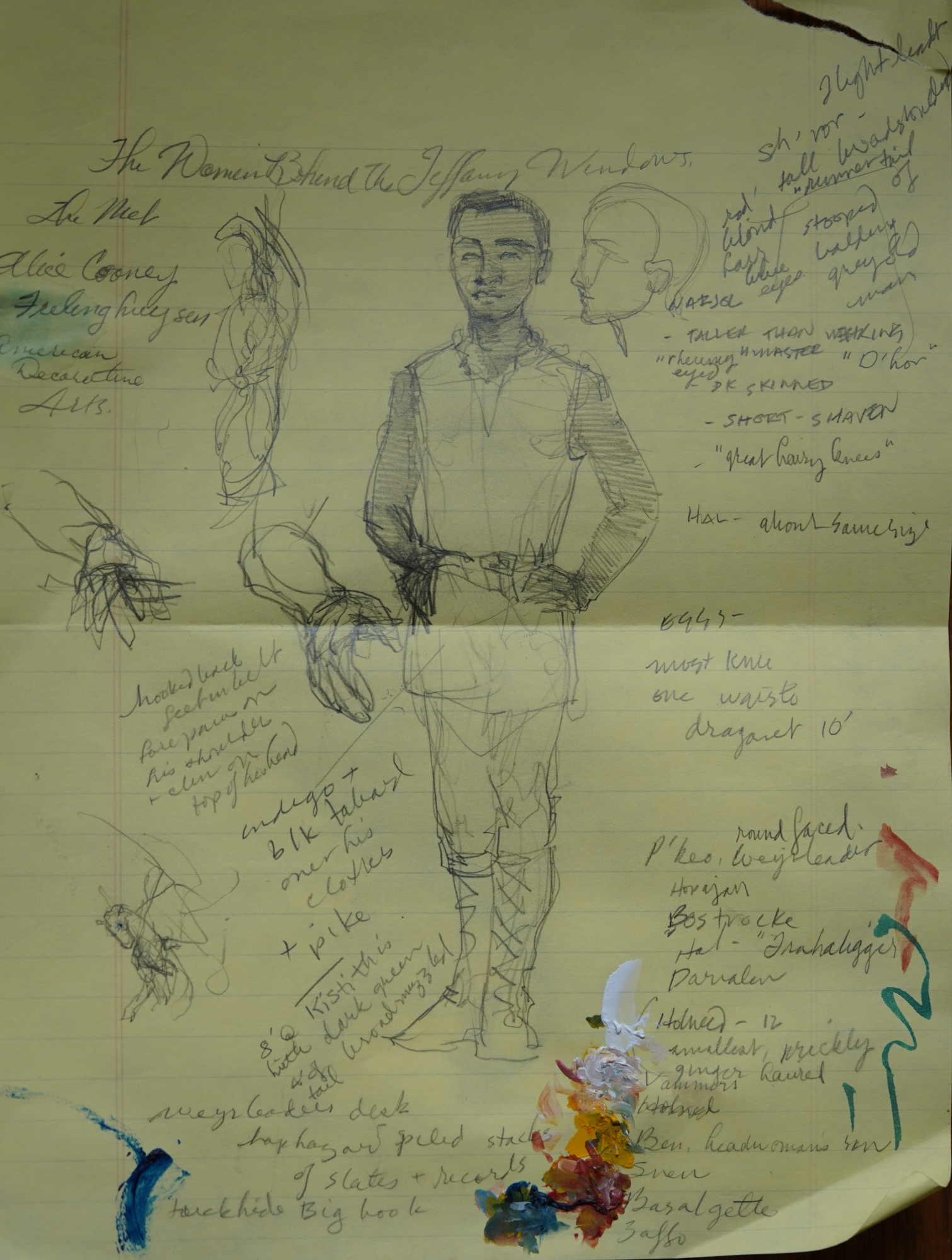
graphite on lined yellow paper, roughly 8.5 x 11", notes for character descriptions & ideas for Jolly. Pixel pro 6. You can also see I used the paper as a palette for the final piece;)
One element I really like in the fanfic is that the dragons come in an assortment of colours—the way they were described in the original series implied each color was very consistent, like, say red squirrels or white-tailed deer: not a lot of variation between individuals. This particular dragon is described as being dark green, but I drew the wings lighter to imply their translucency (not altogether successfully, but I expect if I keep illustrating this series, I'll have lots of opportunities to nail this down.)
The author basically gave me carte blanche to illustrate whatever I liked so I chose this scene for several reasons (more serious spoilers for Dragonchoice V follow)
- Impression, when the human-dragon pairs bond, is generally considered a high and happy point in Pernese stories, and this story has some heavy elements. I wanted to start with something upbeat!
- The candidate, Jolly, is unusually well grown, being as big as many if not most adults, while his dragonet Kistrith (a newly hatched dragon) is the smallest colour, green; thus, he's able to carry her, which makes their particular impression unusual (Carrying dragonets, physically implausible for many candidates, is discouraged because the dragonets need to develop their leg strength).
- Plus, the description of the dragon resting her head on his was just adorable; note that I made Kistrith's skull more rounded, as it is in many baby animals, e.g. foals.
- I thought I could do some fun Baroque style twisting of their pose;
- I was able to completely sidestep clothing issues, as the Impression garment is described & very simple; also, I had a good idea of their relative sizes[6] since Jolly is described as being large-adult size, I figured at least 5’6" (the number I initially used) and 6’; Kistrith is 8’ long of which 4’ is tail.
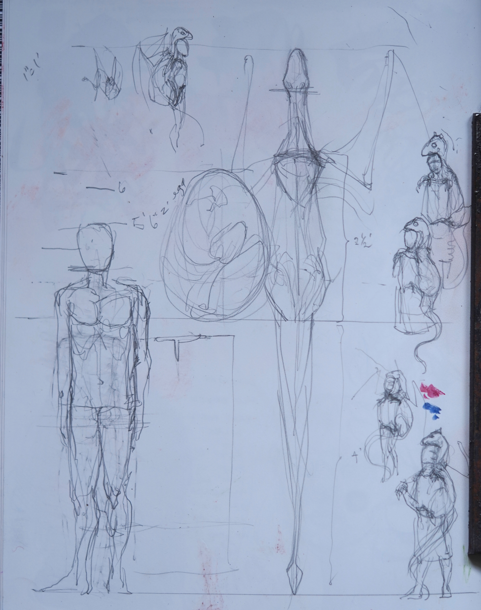
working out the relative sizes of dragonet and candidate: I would've almost certainly made the dragonet too small without creating this 1" to 1’ sketch, which is on the facing page to the other.
The research to make this art took (by far) the longest; I had to reread Dragonchoice V, spend a bunch of time working out my issues about dragon chests, angst some more on the technology (the author points out that in this universe telescopes are a thing, but possibly not eyeglasses, which seems pretty unlikely, since these folks do read and do other fine work; and pottery is never mentioned, despite its being one of the oldest crafts there is; I expect only cooking, butchering, leather, and fiber making[7] pre-dated it.)
Second to research was figuring out the pose. As actually described, I think Kistrith is basically riding piggyback, but that's no fun to draw; I wanted something more dynamic. Just as I was using cats as inspo for forelimbs, I was also thinking about the way they dig their claws in for purchase, probably where the ‘fire lizards’ (miniature dragons, roughly cat sized pets in these stories) habit of climbing people comes from. So I thought I could rationalize this as the point in time when Kistrith is scrambling up.
There happened to have been an absolutely gorgeous sunset during one of my daily walks with the wizard (I think the time period for the story is actually mid-day, whoops! and it takes place in a cave? lit with greenish-yellow light, double-whoops! so clearly I took some artistic liberties with the lighting, here. In my defense, one of the recurring motifs in Pern is the ‘Red Star’ or ‘Red Planet’, from which Pern's direst threat, thread, emerges; the point of the dragon-human pairs is to destroy it as rains, ravenously, from the sky.)
For Jolly, the story is a new beginning, as he transitions from one career (& family) to another. But there is also a darker, framing story that speaks to an ending; thus sunrise or sunset, I wanted to subtly imply these various losses and gains, these changes, as represented by the changing light. Plus, of course, that gorgeous sunset I wanted to incorporate.
I failed—because I wanted to get this thing done, and couldn't face developing a crowd scene (which at minimum meant reading re-reading the story to get physical descriptions of the candidates, scattered throughout, to have a hope of matching them properly with dragonets, not to mention the fact that I find crowd scenes, even small ones, very challenging—to draw any background.
I also never did really fix Kistrith's left forepaw and right hindpaw; not even resorting to nice, opaque acrylics solved the problem, not helped by the extremely slick surface of the paper. I will say that karst paper really does lay nice and flat, even when aggressively wet down, which I really appreciated. This stuff definitely falls into the ‘use up an entire sketchbook, cuz till you do, you will continue to find the paper frustrating.’
I also have some fun ideas for the next one or two illustrations.
This was a very engaging project to do. Apologies to those who read to the bottom and are scratching their heads about those minutes they'll never get back; but I myself enjoy reading other artists’ working processes, and quite frankly will forget most of this stuff if I don't write it down, so for those who do enjoy such documentation...here we are;)
[1]Of whom Michael Whelan, who did Pern's most famous artwork, was my favourite, with a number of others closely behind, with Don Maitz—I especially loved his Cyteen & other C.J. Cherryh covers—perhaps next in line, for his extraordinary colour and graphic elements, which combined so beautifully with his figurative work.
[2]Almost assuredly, from an interview in Locus magazine, which was—and still may be— the trade mag for authors in the sf&f community, as well as diehard fans. I owe Marshall Tymn for telling me about this publication, run by Charles N Brown for many, many years.
[3]Clavicles—collarbones—are certainly very helpful for moving one's forelimb, but not absolutely necessary, as I happen to know from experience, since I have only one that works properly.
[4] We know from her letters that Jane Austen knew exactly what Jane and Lizzie looked like (and also, presumably, Wickham and Darcy) but the only real details in the book tell us that since the beautiful (& taller) Jane was heavier than Lizzie, the latter was probably rather skinny, whose attractiveness mostly expressed itself through her lively personality, as shown in her ‘fine eyes’. Also, Wickham is the good looking one; having Colin Firth play Darcy was a nod to audience expectations and desires, not adherence to the text.
[5]i.e., to avoid manga-face syndrome, where everyone looks the same except hairstyle.
[6]Naomi Novik, in her Temeraire series, has these helpful drawings showing human to dragon size comparisons for the all the various kinds, but I haven't found—or long since forgotten—the sizes of the various dragons. Which changes over time anyway, both in the original books and even more so in Dragonchoice.
[7]ISTR some of the oldest Jomon? pots were impressed with cords, either for functional or decorative purposes
Unless otherwise noted, text, image and objects depicted therein copyright 1996--present sylvus tarn.